Lawline
The Lawline service is used by well over 100,000 lawyers who pay a monthly subscription fee to access content and complete courses. As part of a comprehensive redesign of the product, everything from business cards to user research and UI development were on the table. The goal was to futurize the product and put it so far out ahead of competitors in terms of UI and capabilities that customers would immediately see the benefits of learning with Lawline.
Scope
The designer role at Lawline was a brand new position within the company. Previously work had been done ad-hoc with freelance designers filling in when deemed necessary. Design was never an important part of the process. With the resposibility of leading the design direction, tackling redesigns of two core products: the course details and bundles pages were of the utmost importance. These pieces were an evolution of existing content, a collection of best practices from the industry, and a visual overlay to tie it in with Lawline's visual language.
Design System
Developing a visual language is an important place to start when designing for any product. Without a clear visual direction, leading the team down the road of becoming a modern, tech-forward leader in the industry started with design. Bold and clear typography, plenty of space around UI components, and consistency of product were (and continue to be) remixed into various components of the product.

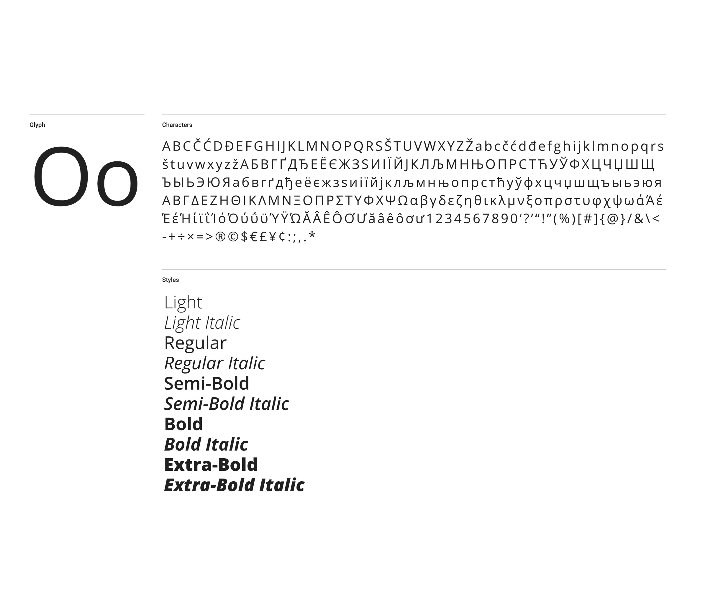
Typography
The Lawline product is based around the flexible Open Sans font family.

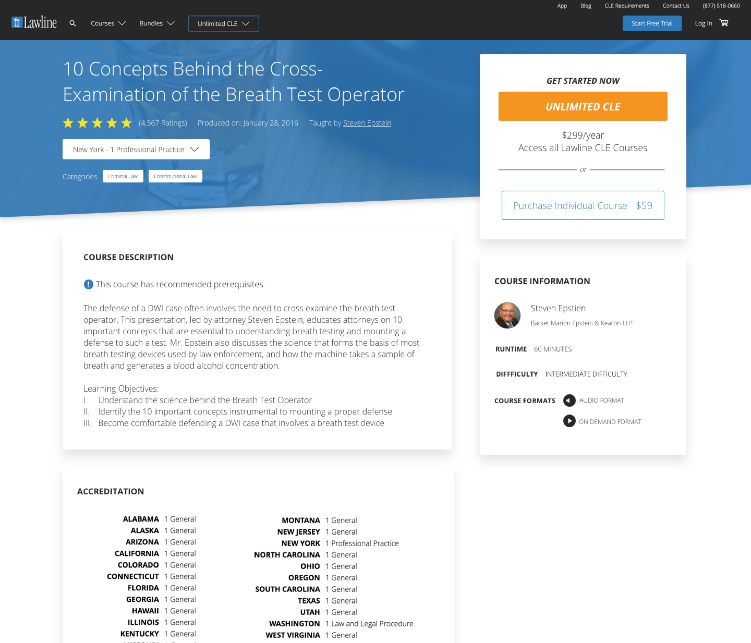
Course Details Page
Using Lawline's design system to build quickly build pages.
Course Catalog
The Course Catalog was an immensely important component of the Lawline product. Besides the Course Player, the Course Catalog was the highest touchpoint page across the product. This is where users discover new content. The design ethos of this page centered around embedding Course Cards in a logical sense to make discovering content a breeze.
Clear headings organizing content, interaction buttons to help quickly filter content, and the organization of Cards was all intentionally designed to make things clear to the user.

Course Catalog
The Course Catalog serves as a library of content for users.
Course Card
One of the most pervasive components of Lawline's product is the Course Card. The intention of the Card was to create a digital representation of a physical product. From research, we determined the typical Lawline user as skewing towards an older demographic. These users weren't necessarily tech-savvy, so creating a tangible-like connection was an integral piece of the UI.
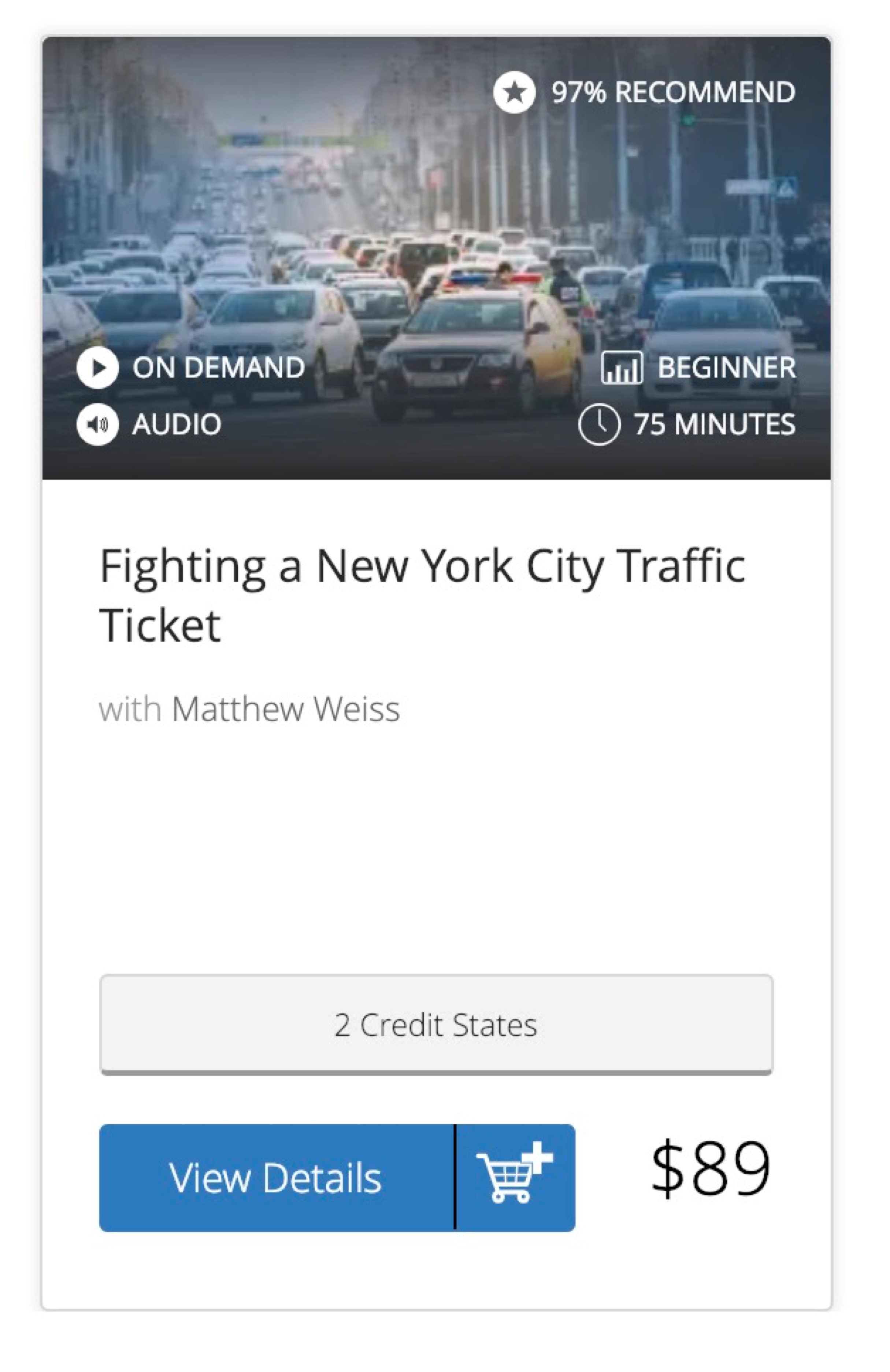
Course Cards were designed to be flexible. Composed of a header and body, Course Cards can take on any variation of the core product – On Demand content, Live Broadcast content, and even Bundled products.

Base Course Card
The logged-out experience shows the price and other essential information.

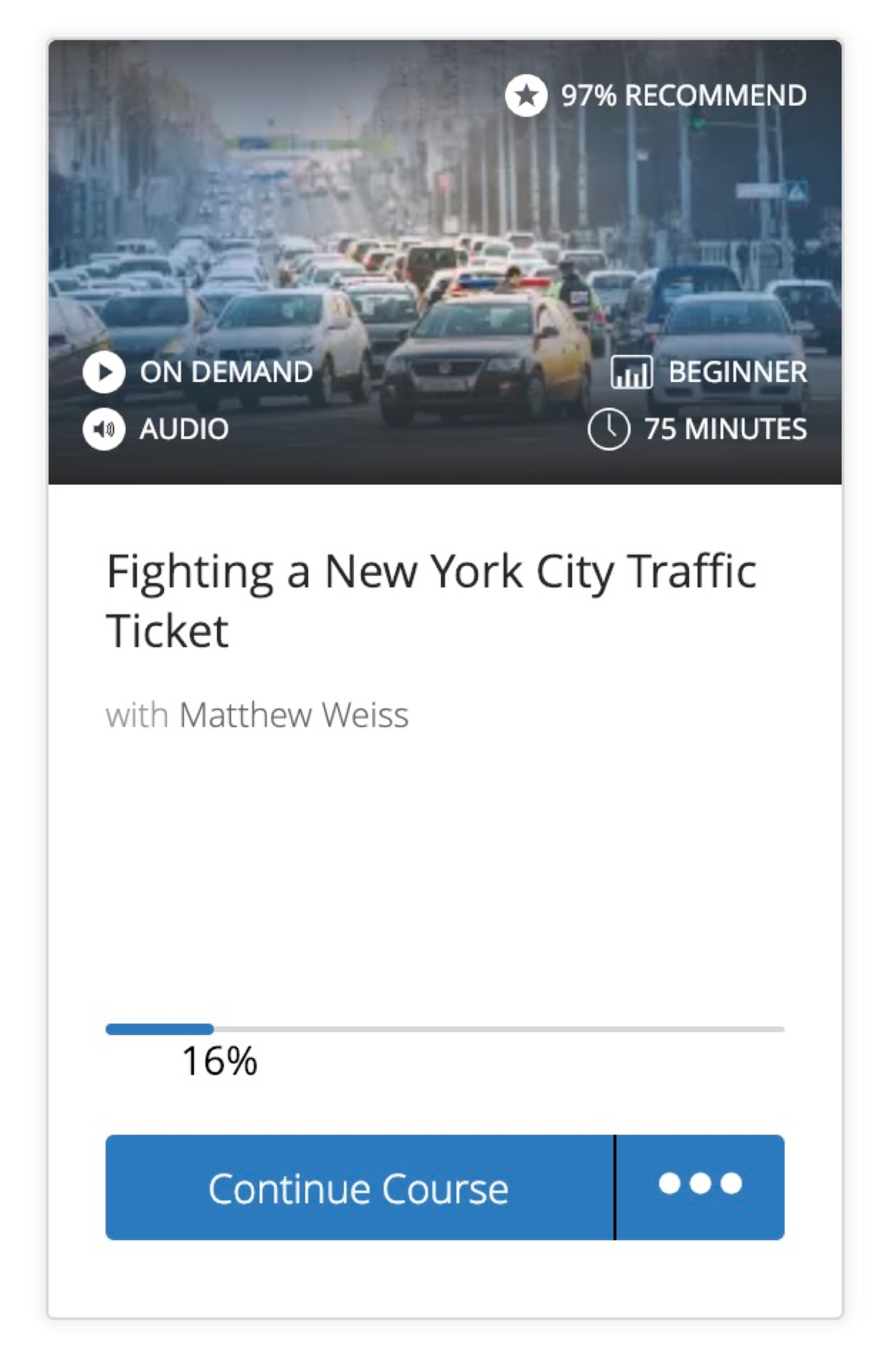
Dynamic Course Card
For logged-in users, the Course Cards shows pertinent CTAs.
An intentional decision of the Card was to make the call-to-action section flexible across user states. A user could be multiple things: a logged out user, a purchaser of a single product, or an unlimited customer. Keeping the button flexible lowered the cognitive load of a user. Simply click the button, and the system takes care of the rest.
Credit Tracker
Lawline's Credit Tracker was a breakthrough in the industry. I was responsible for developing the UI of the product – keeping track of user's credit states, giving them a glanceable way of checking their progress, and providing quick links to important information like requirements and course certificates.
Credit Tracker
The Lawline credit tracker allows users to track their progress and completion across multiple states.
Liked what you saw? Browse more work.