

Chicory
When you're revolutionizing an industry, you've gotta put your best foot forward. Working with Chicory, we rebuilt the brand from the ground up and put together design systems to ensure consistency in the future.
Scope
Technologically advanced. Attractive to both users and brands. Modern. Forward. Tech-enabled. Building a brand around ideas takes a village. The input and guidance from both senior and junior team members was vital to build a brand capable of crossing business initiatives.
Chicory's remarkable new identity is a product of focused research, strategy and execution. It perfectly conveys the foundational brand values of a modern, technologically-focused company adept and capable of tackling the future of grocery
Logo
The first thing to tackle was the outdated brand logo. While playful, the original Chicory lacked any sense of refinement or modernism. The chef's hat alluded to the connection with cooking, but didn't convey the technological advancements the team had made behind the scenes.
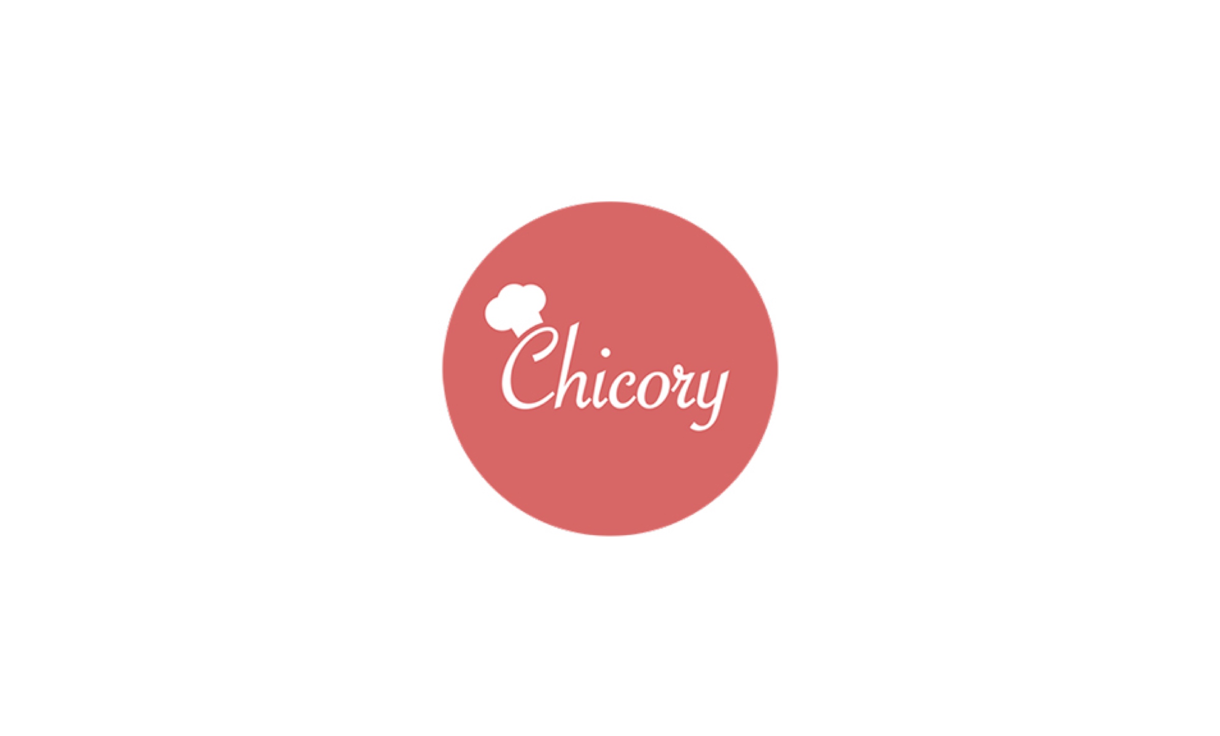
Original Chicory Logo
While effectively communicating the association with food and cooking, the original Chicory logo was severely outdated.
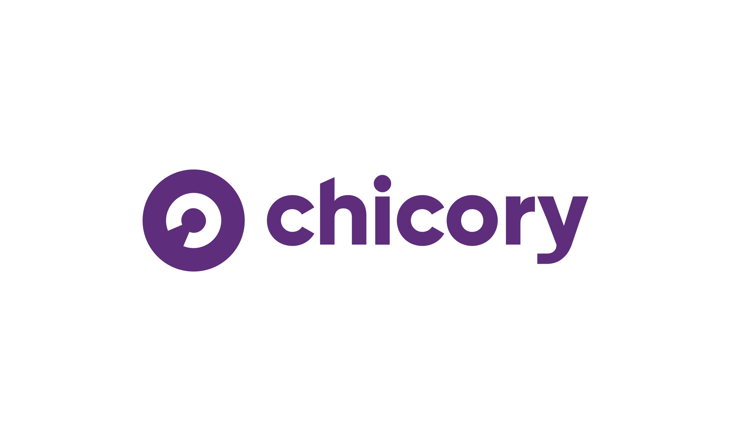
New Chicory Logo
The new logo embodies the tech-forward nature of Chicory.
Chicory's new logo visually exhibits the changed brand. Using a bold purple as its base, the lowercase "chicory" wordmark is a more minimal and modern treatment than the previous design. Chicory's new icon plays with the "c" of Chicory, turning it on its side, a playful hearkening to Chicory's mission to challenge the business-as-usual mentality in the grocery industry. The “c” also resembles a digital device's power button, highlighting Chicory's identity as an always on, always working company with tech at its core.
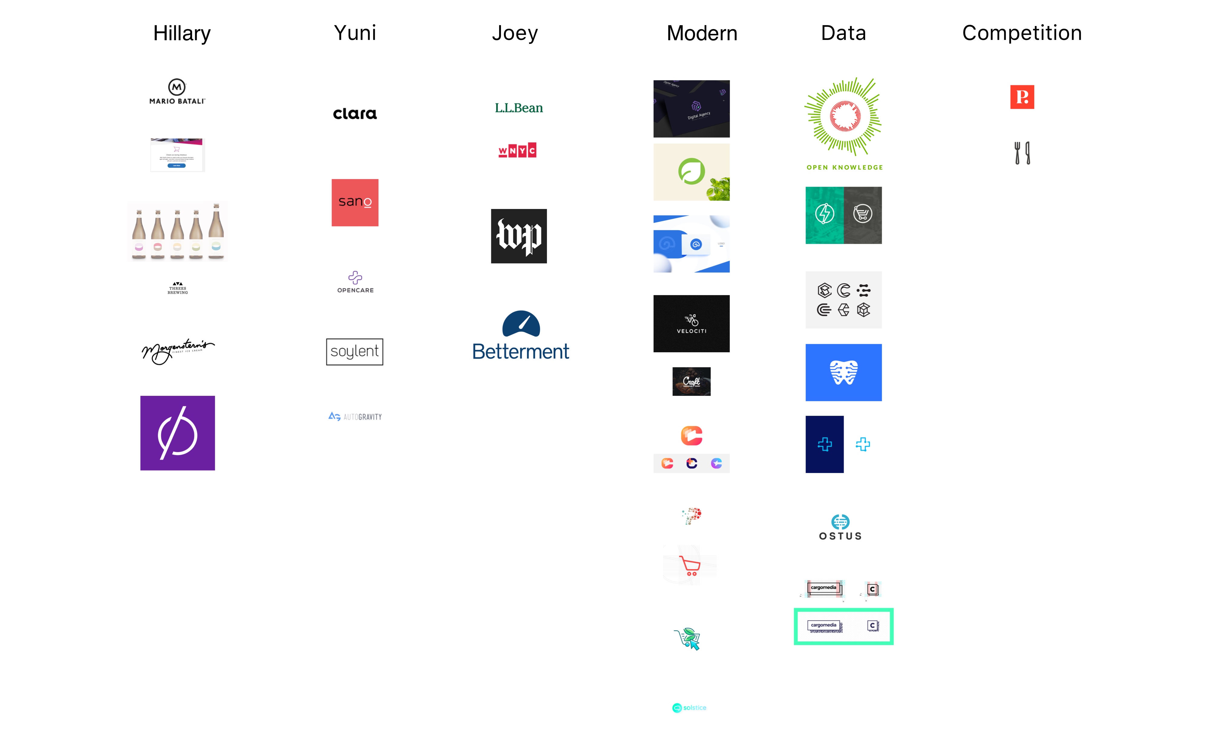
Moodboard
The executive team was asked to share logos they admired or thought were associated with Chicory's mission.
Iteration & Refinement
The Chicory logo went through multiple iterations before ultimately reaching the final product.
The final logo was a product of input and refinement from the team. Taking visual input from the team and running through various iterations ultimately helped produce the perfect final asset.
Design System
To ensure the team was equipped to expand and build upon the core design, a styleguide and design system were developed.
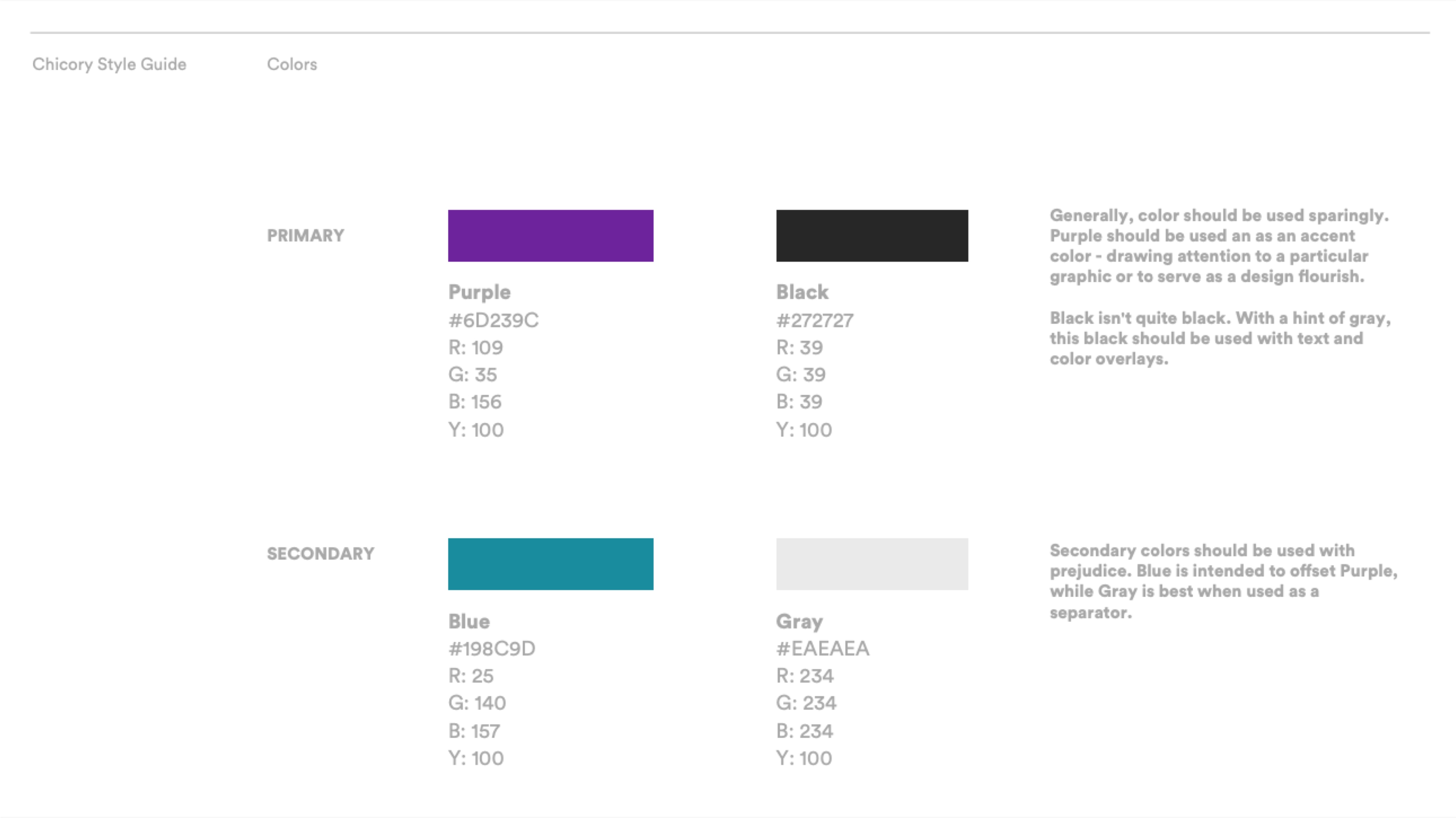
Colors
A focused guide to color usage
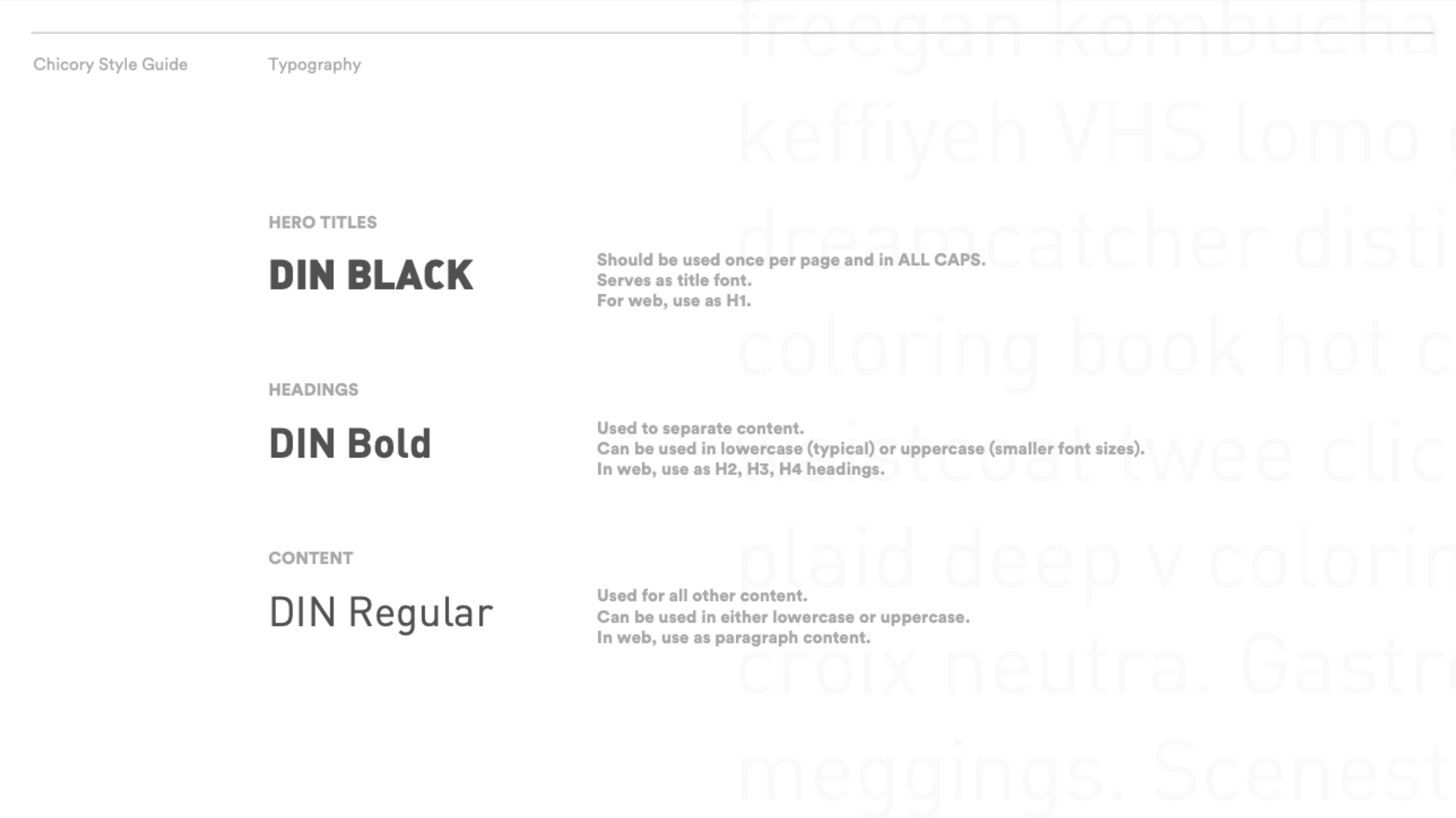
Typography
Simpifying the number of fonts to use leads to a cleaner, more focused design.
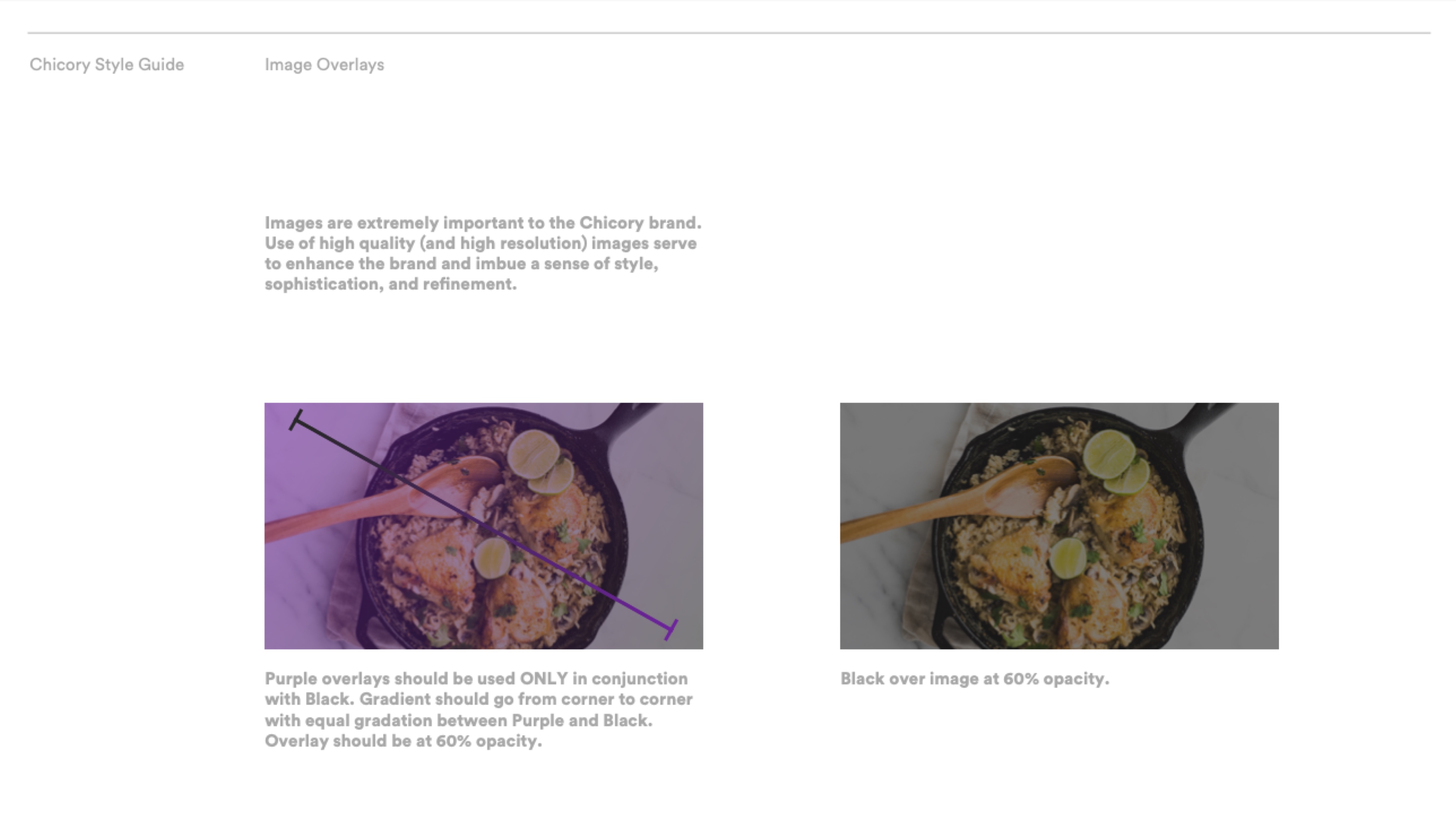
Photo Overlay
Color and gradient overlays help tie image families together
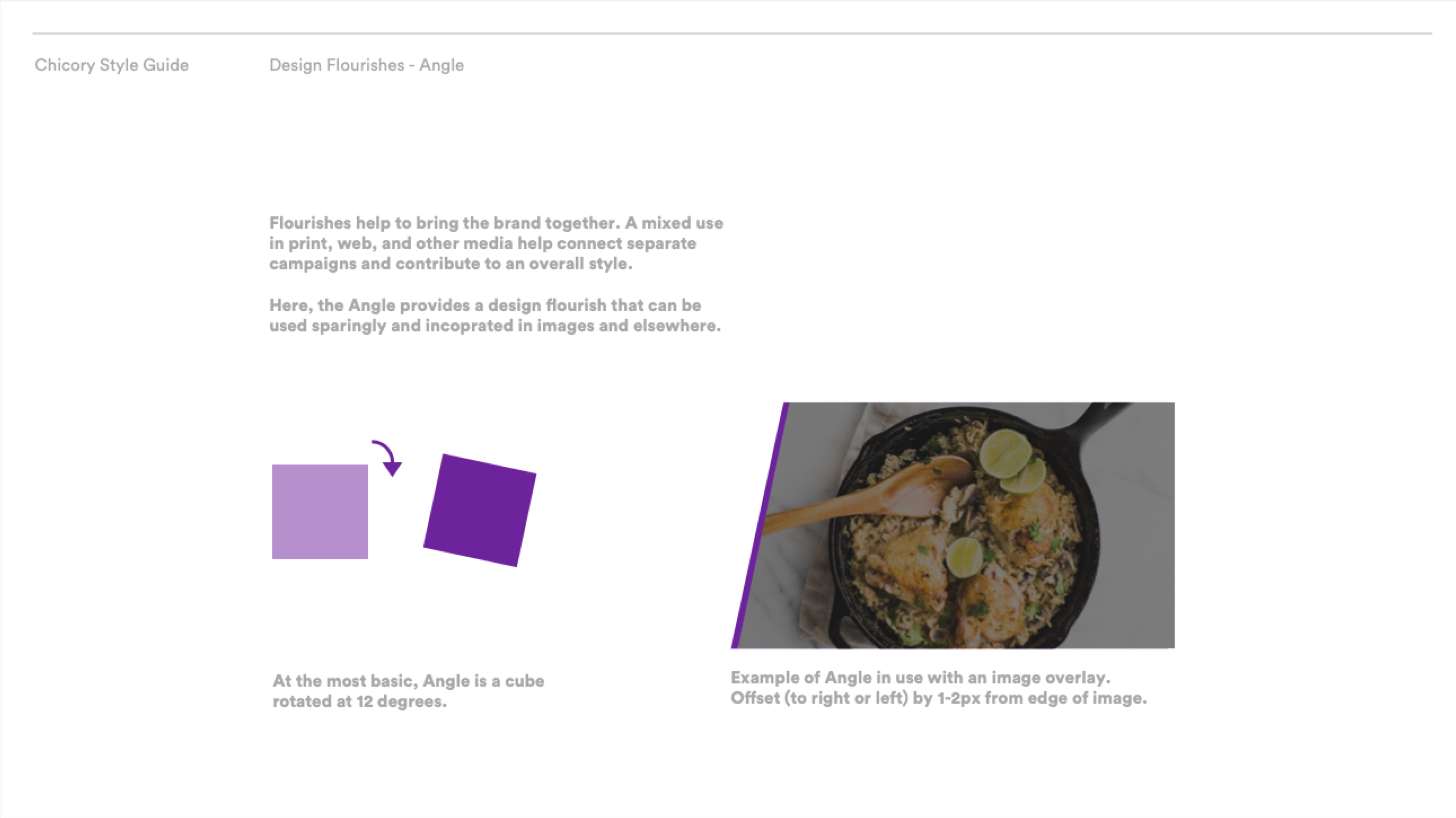
Angle
Based off an angle found in the logo, the angle helps give photos and graphics a distinctive flair unique to Chicory.
Iconography & Illustration
As the brand grew, it found the need to branch out into other areas of design. An iconography system was developed based on the design system and an illustrator was contracted to help build out common scenes for use in marketing. Later, pitch decks were designed using the base design system with additional flourishes.
Iconography
A set of icons derived from Chicory's design system.

Illustration
Based upon Chicory's colors, a number of illustrations were commissioned for the brand.
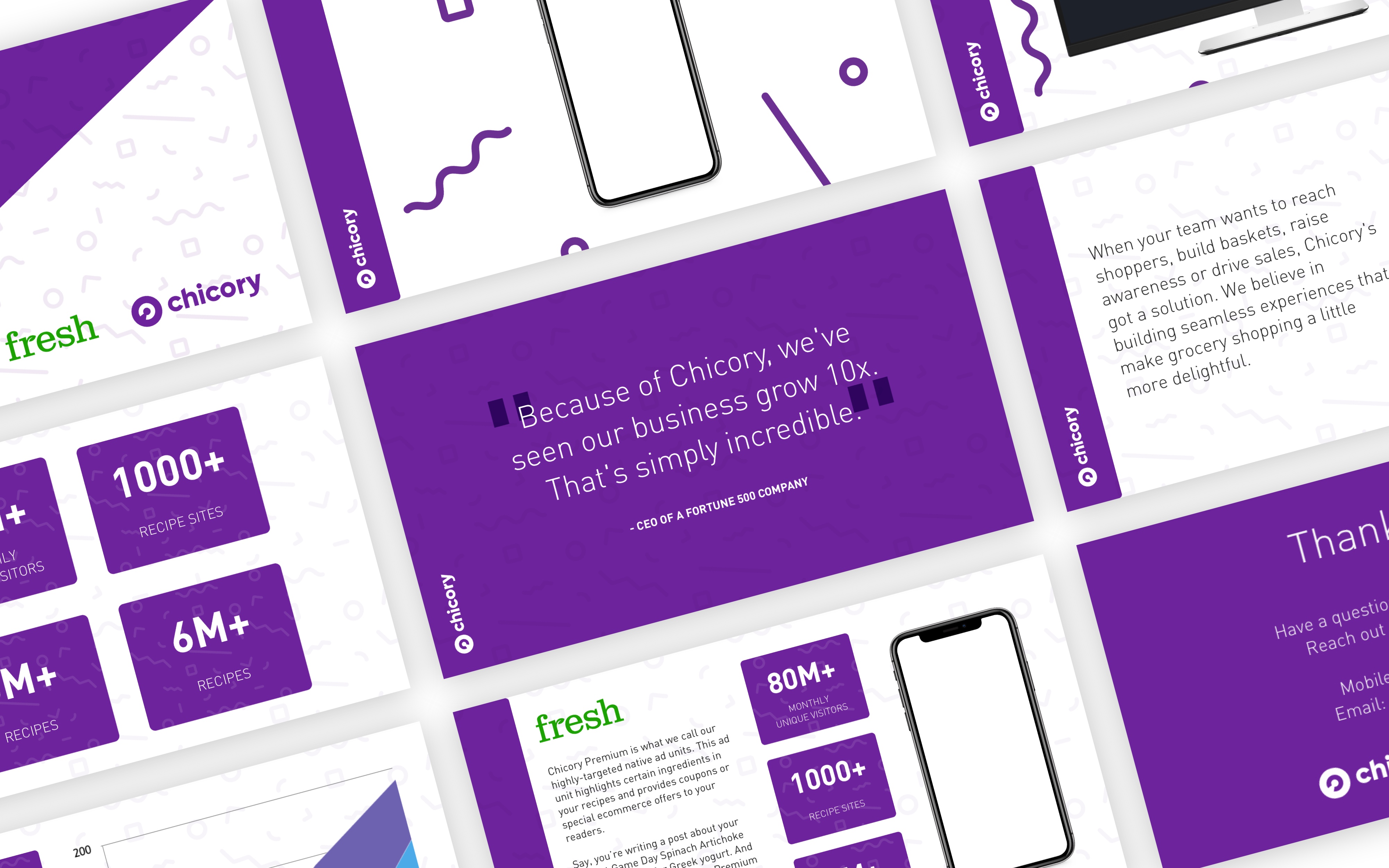
Pitch Deck
A pitch deck derived from Chicory's design system.
Liked what you saw? Browse more work.