
Issue 4 ·
Issue Four
Behind Vox Media's Newspaper-Inspired Homepage Redesign · Opulence on Rails · OKCupid's Terrible New App Icon
From the 2017 archive. These picks reflect their original publication date; external sites and offers may have changed.
While there are some great articles in the Issue this week, I feel like the "You Can Learn Anything" resource at the end deserves some extra attention. While the concept is stellar, I want to strongly suggest that you spend some time with it! Just tapping through the "design" maps, I found some pretty cool resources that I'd never seen before. Who knows? You could stumble upon something you want to learn.
Have a great weekend!
Editorial pick · via Vox Media
Behind Vox Media's Newspaper-Inspired Homepage Redesign
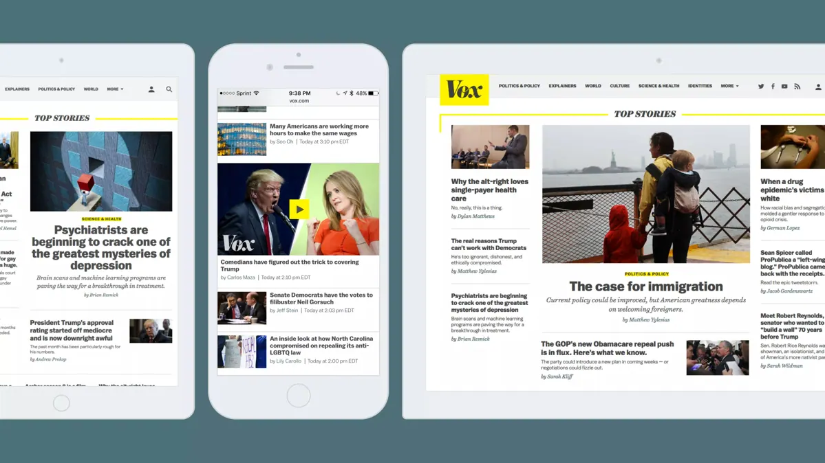
Vox Media is the parent company of some of my favorite sites including The Verge, Polygon, and Recode. They've got some really great design chops and their transparency behind their recent homepage refresh is pretty interesting. It's always insightful to take a peek behind the curtain and see how many iterations and versions is takes to reach the final product.
Editorial pick · via Luxury Launches
Opulence on Rails

So everyone's talking about the Hyperloop, but let's take a step back and think about what's really important while riding a train. Baths. Check. Personal observatory decks. Check. Thank goodness for Japan's Shiki-Shima luxury sleeper. Who's in for splitting a ticket with me?
Editorial pick · via The Outline
OKCupid's Terrible New App Icon
OKCupid had the right idea going into their recent app icon redesign. It was supposed to represent the "chaos" and "mess" that is dating. Their execution was pitiful, though, and the ultimate product was just a mess.
Editorial pick · via Design Milk
A Trio of Beautiful Limited Edition tokyobike Bikes

tokyobike is synonymous with beautiful, clean bikes. Three new limited-edition bikes from Calico Wallpaper, Everything Elevated, and Joe Doucet are my new lust-worthy obsession. My favorite? The white/gray split for sure.
Editorial pick · via Microsoft
Fluent Design from Microsoft
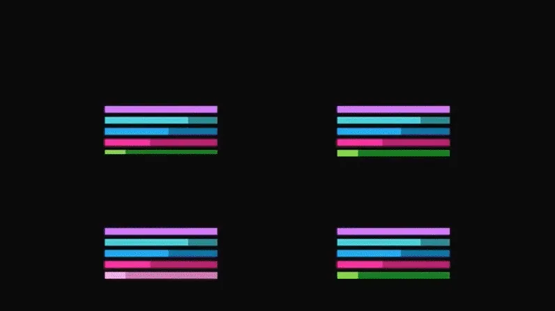
View original animation (8.2 MB)

Fluent Design is Microsoft's answer to Google's Material Design language. The entire intent is to make it easier for designer and developers write more "delightful" applications that work well across all your different devices.
Editorial pick · via GitHub
Awesome Design
Is it too meta to curate a curated design list? Probably, but that won't stop me from sharing Tony Chan's Awesome Design GitHub repo where he collects high quality resources and tools for UI & UX designers. Take a look through - I've found some new resources you'll probably find in future Issues.
Editorial pick · via MindNode
You Can Learn Anything
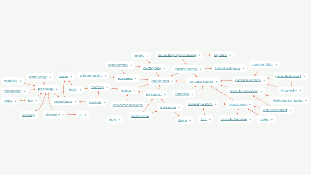
There's a reason I saved this link for last this week. I stumbled upon this on Hacker News this week and quickly got lost down a rabbit hole checking out the design bubble. With over 3000 links, I'm sure you'll find something to learn.
Interested in more? You can check out the GitHub repo for WAY more info about the project.