
Issue 8 ·
Issue Eight
Why you should just say no to Helvetica · Fancy Designer Job Titles · A typeface that caused NZ residents to question their cultural identity
From the 2017 archive. These picks reflect their original publication date; external sites and offers may have changed.
Welcome to Issue Eight of Very Cool Weekly.
I've got another batch of interesting articles for you this week! First up we've got the father of grunge typography on why you should just say no to Helvetica, a breakdown of all the different (but same) design job titles, an existential crisis caused by a typeface, a really great argument against the hamburger menu, some design resources straight from Apple, and some really intuitive new volume sliders.
Are you enjoying Very Cool Weekly? If so, share it with someone who might think it's interesting. It goes a long way and would mean a lot to me.
Have a great weekend!
Editorial pick · via Magenta
Why you should just say no to Helvetica
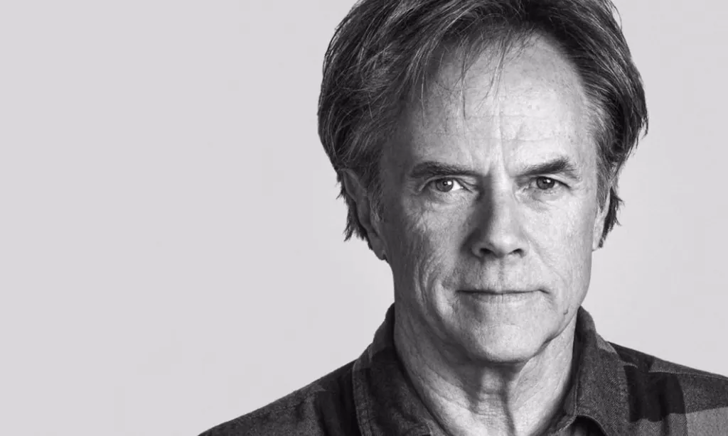
It's easy to fall back on tried-and-true design trends. I'm guilty of it myself quite often. If something works, why change it? "The father of grunge typography" David Carson discusses lazy design and why Helvetica should be avoided in this insightful interview-style article from Magenta.
Editorial pick · via Medium
Fancy Designer Job Titles
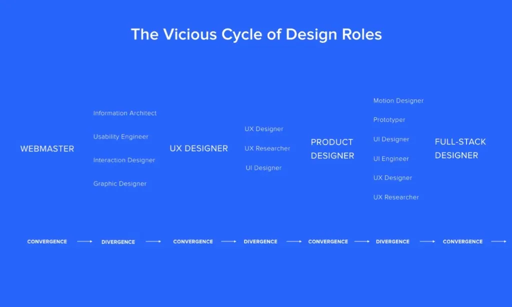
When I talk to someone about what I do, I usually try to explain it in a way that would make sense to them. If I'm talking to someone in the business, I might use a term like "full-stack designer." To my Dad? "Graphic designer." The truth is, as designers, we blend a lot of different roles depending upon the situation. In this article, Marcin Treder talks about paring down the (often overwhelming) amount of titles we use to explain what we do.
Editorial pick · via Eye On Design
A typeface that caused NZ residents to question their cultural identity
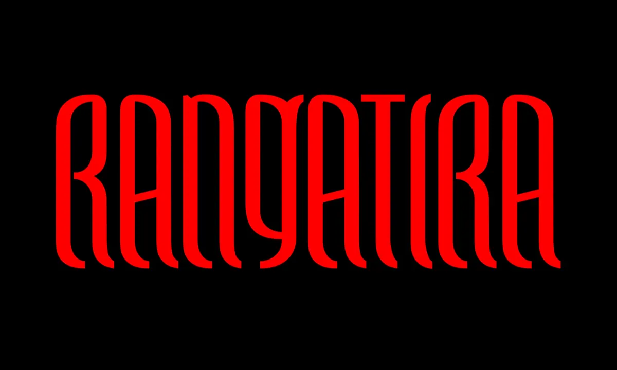
I had no idea who or what the Māori community was before reading this piece from Eye on Design. In a fairly in-depth article, EoD discusses how New Zealand-based graphic designer Johnson Witehira caused something of an existential crisis among his community when researching what a Māori-first typeface should look like.
Editorial pick · via Medium
Why Reach Navigation Should Replace the Navbar in iOS Design

It feels like everyday we're going back and forth on what type of menu system/navigation system works best for users. Brad Ellis makes a pretty fantastic argument for why "reach navigation" should replace the navbar - at least for iOS.
Editorial pick · via Apple
iOS 11 Design Resources from Apple
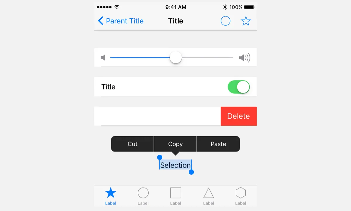
While we wait for Facebook to put together a more comprehensive iOS 11 UI kit, we've got Apple to thank for the basic. Follow the jump for links to Photoshop, Sketch, and XD UI kits!
Editorial pick · via /r/programmerhumor
Intuitive Volume Sliders
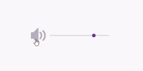
View original animation (0.4 MB)

Rounding out this week is a groundbreaking set of volume sliders that I, for one, will be using in future designs. Check out the link for a filtered list of solutions from the best and brightest UX designers on Reddit's /r/programmerhumor.